Hu Jing Brand Identity Project Includes:
Art Direction
Brand Identity
Creative Strategy
Packaging & Merchandise
Typography Design
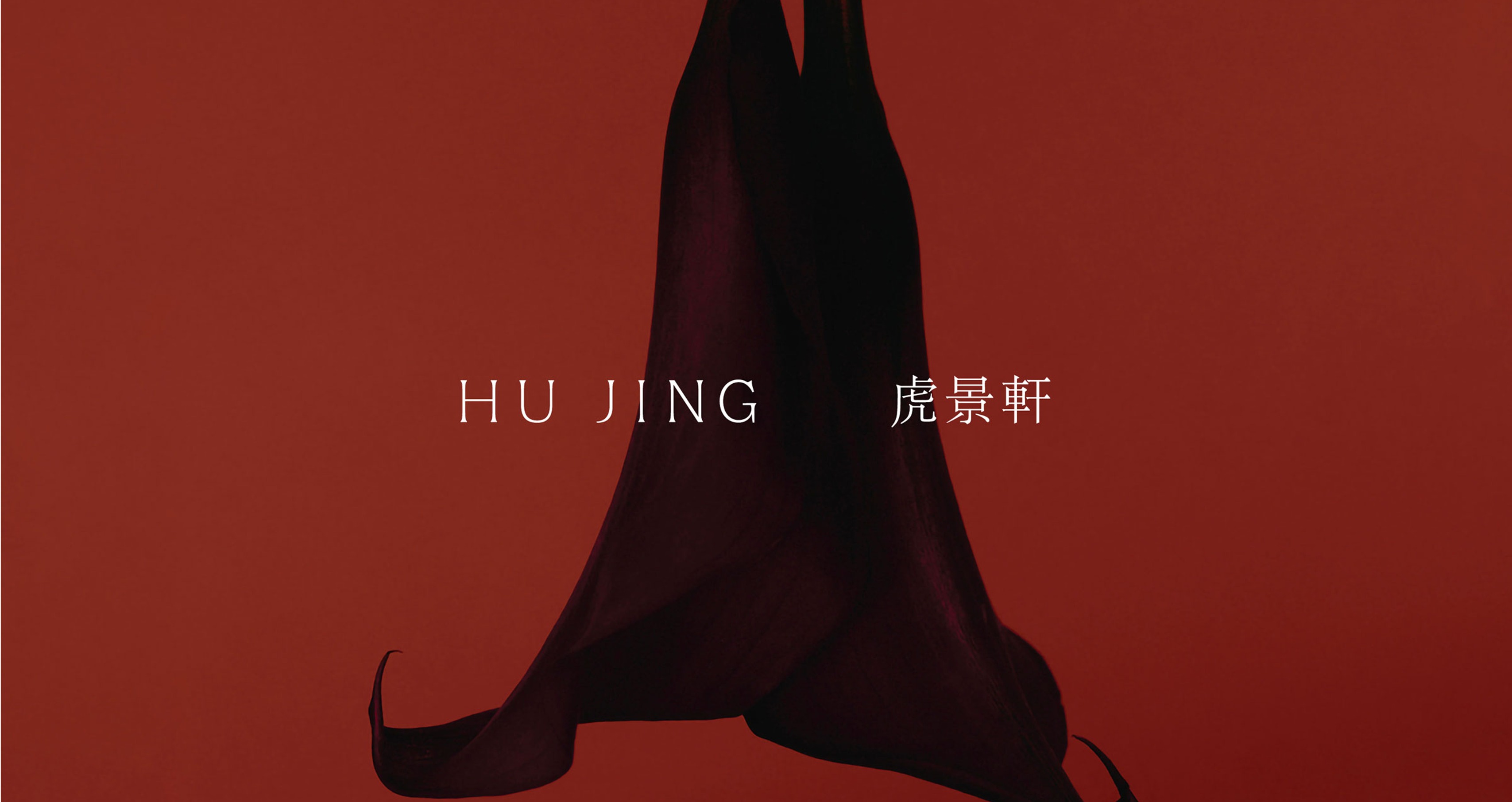
The brand identity for fine dining restaurant, Hu Jing 虎景軒.
Hu Jing 虎 景 軒. The Chinese character 虎, translates to Tiger. It holds significance as part of the word Toranomon (虎ノ門), one of the gates of the old Edo Castle. The name Toranomon is believed to be influenced by Chinese feng shui philosophy, where its four deities are associated with animals.
The White Tiger symbolises Toranomon, characterised by the colour white, the metal element, and the autumn season. This forms the foundational colour palette for an exquisite Chinese culinary journey at Hu Jing, featuring a renowned wood-roasted duck, a diverse selection of dim sum, and fresh seafood delicacies, offering a delightful range of flavours.

Creating Hu Jing: Art direction and bespoke menu designs
Bespoke design for Hu Jing chopsticks

Elegant typography and layout designs

Crafted threshold: Bespoke Hu Jing logo design on signage

Rich and tactile materials palette with autumnal tones

Creating Hu Jing: Full set of bespoke menu designs

An intimate mood: Art direction for Hu Jing

